Saturday, February 18, 2017

Spring begins to show her face

14"x14"  mostly Terry Ludwig pastel on Pastel Premier 400

I'm always excited this time of the year when Spring begins to show her face

quince

pear tree

migrating cedar waxwings

We don't get much snow down here in Georgia....practically none. So when I see all the snow paintings my artist friends are doing, I'm a little jealous. I have to get inspired with the grey's and browns. I usually go to my collection of bird nests for some inspiration. 

I pulled this one out of the box and put it on a plate in my studio

 I chose Pastel Premier sanded 400 grit paper. I did a watercolor underpainting to cover the white of the paper and then added some clear gesso for added texture. The more I work with pastels , the more I prefer the rough surface where I can build up the layers of paint and pastel. So while it is cloudy and rainy out side, I can be inspired in my studio. Enjoy! Spring is on the way!


Monday, February 6, 2017

painting some more animals

11.5"x15.5" pastel on Sennelier LaCarte sanded paper
"shaggy"

I really enjoy painting animals and birds. I try to capture their personality. Another reference photo from my trips to Connecticut. Again I drive by these cattle many times. They are Scottish Highland cattle. I love their long hair! This sanded paper is perfect for doing animals. I don't need an underpainting as there are several colors of paper to chose from. I mostly used Terry Ludwigs Box of Shades of Nature pastel plus some great American and Diane Townsend.
Here is my sketch

I have been asked to do several commission paintings of dogs and cats. If possible I try to meet the animal, photos don't always tell the truth, so I like to see the real thing!
Here's Lexxie! My neighbors cairn terrier, who I spend a lot of time around. I always start with the sketch. then go to the painting. Again I used the Sennelier sanded paper.

5"x7" pastel
sketch of Clementine and Cupcake to get familiar with the dogs. I met both of these sweet dogs.

Clementine is Cupcakes Mom.
Both paintings are 6"x6"


Meet Roxanne! A cute Tabby rescue cat. I did not get to meet Roxanne and had to work only from the photos I received from the client. I did several sketches and they decided which pose they liked.
this painting is 5"x7"


Meet Okra! this is my daughter's cat. She is part siamese and is a real sweet kitty
sketch in my sketchbook and the 8"x8" painting on black Sennelier sanded paper.
8"x8" pastel on a grey black Sennelier sanded paper

Ok last one for this blog post. If you know me , you know I am a fan of owls. Photo credit reference goes to Sagar Suresh from the OWL pages on FB. I actually did the painting first and then went back and did a sketch.

Hoot Hoot!


old....but not forgotten

5"x7" quick pastel study

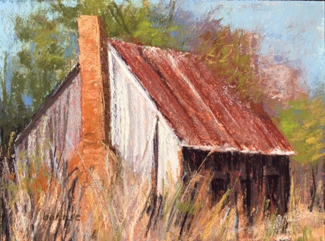
Who isn't attracted to vintage buildings? I love them and am always taking photos with a future painting in mind. On a recent trip to Alabama, I took some photos of this forgotten home on the edge of a cotton field. I did some sketches to get familiar with the structure and also did the quick study above to work out some of my color ideas.
pencil sketch in my sketchbook

14"x14" pastel on mounted pastel premier 400
Here is the larger finished painting. I did a watercolor underpainting to cover up the white paper. I had a lot of fun painting in the grasses. Giclee prints will be available of this painting.

9"x12" pastel on multi media pastel paper.
I had fun with this one. The underpainting was nupastel and clear gesso to add extra texture to the paper. Then I used a little watercolor, let it dry and then put the pastel on top. 

another sketch from my sketchbook of a barn I saw on trip to Connecticut . When visiting , I drive by it all the time , so I have seen it all seasons and painted it before. I had fun with the multi media pastel paper and decided to use it again for this painting.

"winter's grey" 11"x14" pastel on multi media panel

For the underpainting, I did a  blue violet Crete color drawing and brushed it in with the clear gesso. Then I went back with some nupastel for some of the color and brushed that in with the clear gesso which left me with a lot of texture. I used Terry Ludwig and Great American pastels to finish it off. Giclee prints will be available of this painting.


Sunday, January 8, 2017

about my pathway paintings

9"x12" pastel
I thought I would group together my favorite pathway paintings and write a little bit about this theme.  It captures the eye and brings you into the painting. The above painting I did from a reference photo taken in CT at a vineyard. It was a beautiful October day and the vines were bright with yellows and oranges. 
12"x16" pastel
This is from a reference photo from a favorite spot in my bother-in-laws beautiful garden. I always walk there when I visit, going up the stairs or down...... I did this painting at a Richard McKinley workshop where I received a wealth of information and inspiration.

12"x16" pastel
This painting is from Edisto Island SC. We were lucky enough to get a rental right on the beach. This is the pathway we walked every day to get down to the beach. I was fortunate enough to have had this painting juried into a pastel art show.

9"x12" pastel
 Another painting of that Edisto pathway......

12"x16" pastel
This painting is from a reference photo I took while driving around with my sister in CT. I made her stop and go back for the shot. I was so intrigued by the way the sky and clouds met the pathway on the ground. Which way do you see it? Sky to pathway or pathway to sky?

9"x12" pastel
Another vineyard painting with its rows of vines bringing you into the painting. This one from a borrowed reference photo of my sister while she was in Walla Walla WA

10"x10" pastel
This painting is from Edisto Island SC. As I was walking out from these trees, the painting below depicts what I saw. I stood there and took photos from both directions. The sun had just risen and the marsh was aglow with gold!. The road took you to the beach..... but the bugs were so bad I couldn't make the walking trip! 

12"x16" pastel


12"x16" pastel
Two paths merge briefly......

12"x16" pastel
On one of my autumn walks....... join me....

9"x12" pastel
This is at park that is very close to my home. Sometimes when I need solitude, this is where I can go. Follow me down the pathway....

9"x12"pastel

9"x12" pastel
This painting and the one above are paintings that I did intuitively. I had no plan, I just picked up the pastel sticks and painted what I felt.... can you tell I was in a somber mood? The pathways emerged in both these paintings.....


12"x16" pastel 
This is my most recent pathway painting. I have painted it before.... it is from a reference photo I took while I was at Gibbs Garden  GA in the wildflower fields walking with a close friend. The pathway drew me in.......where am I headed, what is around the corner?


Saturday, January 7, 2017

artist in the south


"those cotton fields"  12'x16' pastel on UART 400

It has been awhile since I have posted on my blog. I had to put a new operating system on my laptop. Since I'm not that great on the computer, it has taken me awhile to figure out! The holidays are over and the new year has begun and I am back in my studio. Living in the south, I have always been fascinated with the cotton fields. While down in Alabama for Christmas, I took some photos of the cotton fields and used them as references for some paintings.  Even in the winter, these fields are appealing to me. I started out with doing some small quick paints., not spending more than 20 minutes on each.

5"x7" quick pastel

5"x7" quick paint

I also did a sketch in my sketch book.
in my sketch book

Then I chose the pastels I would use in the painting, adding a few along the way. I try to keep my sticks limited to about 20.

underpainting
For this painting I decided to use a violet Creta color stick with an alcohol wash for the underpainting. I worked it like a drawing, then washing it in with the alcohol and a brush. I used a blue Nupastel for the sky and washed that in with the alcohol also. I wanted to add some more texture, so I added some clear gesso where the grasses and cotton stalks were over top of the Cretacolor drawing. Then I went in with the pastel lightly putting down  layers of pastel.
The cotton fields are so much a part of southern history and there are still many fields today. Machines are used today to pull the cotton from the stalks. I was surprised to see how much cotton is actually left on the stalks after wards.


Monday, September 5, 2016

Walla Walla WA

9"x12" pastel on Pastel Premier Italian clay 320

My sister went out to Walla Walla, WA this past week for some vacation time.  She texted me some photos and that was the spark to start a frenzy of painting for 2 days. I so wished I was there with her!  But I would have to rely on her photos for inspiration to paint. My sister knows what I like to paint, so she kept texting me photos.  Once I started painting I couldn't stop and did 5 paintings in the 2 days. 
This was actually the first painting. I had a smaller 8"x10" piece of the Pastel Premier italian clay 320. I am really liking this paper. I don't have to start with an underpainting because the paper already has a neutral putty color. It has a lot of texture and will take a lot of pastel layers. I turned on some music, I just wanted to start painting! This first painting I did quickly.  One of the vineyards she visited.

I decided to stick with the same paper for the series of paintings. This one is also 8"x10". I really had fun with the grasses. My sister tells me there are wheat fields everywhere, and the texted photos kept coming.  The color of the golden wheat was just beautiful. They had harvested early from all the rain they had , so much of it was cut. 

 I was now ready for a larger one. This one is 12"x16". I decided on a reference photo of some of the uncut wheat. Always good to practice painting the grasses. I had to tell myself to stop!
The fourth painting is one on the top. The structures standing starkly in the wheat fields where great. I think this is my favorite painting of the series.


For the final painting, I went back to the vineyard photos. This one is 9"x12", still on the italian clay paper. It was a cloudy day, the colors were cooler , so I pulled out more blue greens and neutral colors. I changed the perspective some to give the painting better composition. I feel like I want to walk into that vineyard. 
Thanks to my sister for sharing her wonderful photos with me. I'm gifting her the first two 8"x10" paintings and the other three will be available in my upcoming shows.
Art For the Park, Marietta GA November 2-3
Whimsical Wares Art and Gift Show, Marietta GA November 9-13
Vickery Village Artists Market, Cumming GA December 2-3