Friday, November 24, 2017

sky play time

"sky #6" pastel on gatorboard 8"x8"

"Sometimes I go about pitying myself
And all the while I am being carried across the sky
By beautiful clouds"
Ojibway Indian saying 

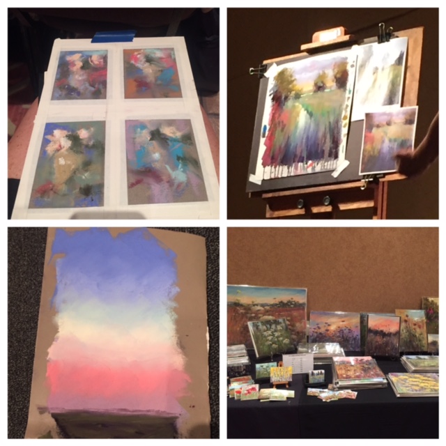
I have been having fun with painting the sky. I had some leftover gator board from another project and decided I shouldn't waste the pieces I had left over. I don't have a lot of studio time because I'm working now, so I just wanted to do some quick paintings and have fun. 


I brushed on some beige acrylic paint and let it dry. Then I brushed on some pumice gel with a lot of texture ( photo to left). When that was dry, I took some neocolor water soluble sticks and did an underpainting letting the colors drip and blend right(photo to right). When that was dry I added pastel and just used my imagination to paint the sky. I didn't spend more than 20 minutes on each one applying the pastel.
Here are a few more examples of what I painted.

"sky #1"  8"x10"

"sky #2" 8"x10"

"sky #3" 8"x10"

"sky #4" 8"x8"

"sky # 5" 8"x8"

comments welcome, which one is your favorite?

.

Monday, October 30, 2017

through the trees

"meadow walk" 12"x16" pastel on Pastel Premier terra cotta medium grit

I realize I have not posted on my blog since July. Truth is, I am going through a life change. Painting time has been difficult for me. I struggle with the words, but in my paintings, my reflections and little pieces of me show through. Seems I am on a journey, walking along each pathway...God seems to be walking along with me, wrapped around most things I do. Learning to let go and have Him guide me along. The autumn is my favorite season - the change in temperature, the changing colors in the vegetation.... change. Over the last month , I have found it very helpful to take long walks through some of the local parks where I live - to get back in touch with my feelings. I wanted to try some of the new darker papers I had picked up at the Pastel Convention in Albuquerque. I prefer the rougher grit and the dark tones of the paper.  Following are the paintings I have done over this past month. Comments are welcome. 

"impressions" 12"x16" pastel on Pastel Premier Terra Cotta medium grit

"autumn reflections" 9"x12" pastel on Uart black 400 grit

"two standing" pastel on Pastel Premier 400 grit

"Chattahoochee trail" 12"x16" pastel on Pastel Premier 400 grit

"morning trail " 9"x12" pastel quick paint on sepia toned Uart 320

"standing tall" 12"x16" pastel on black toned Uart 320

"the way in" 12"x16" pastel on Pastel Premier Italian clay

"leaning in" 9"x12" pastel quick paint on Pastel Premier w gesso underpainting for added texture

Saturday, July 29, 2017

cloud patrol


"doors of heaven" 12"x16" pastel on Uart 320 grit paper

Psalm 78:23
Yet He commanded the clouds above
And opened the doors of heaven

My favorite subject to paint - next to the oceanside- is the sky. When in doubt of what to paint, I always get inspiration from the sky. It's a place where I feel close to God. I like to reference my sky paintings with a biblical scripture and pull the title from that. I feel that I can pay tribute to God by painting His beautiful skies. Who knows - maybe I will get cloud patrol duty when it is my time to pass - WOW - how much fun would that be!
It was a beautiful summer day today. The sky so blue and filled with big puffy clouds. I couldn't resist not painting it! I found two  brand new boxes of Mt. Vision pastels in my studio that I had forgotten  about..... Terry Ludwig pastels are my "go to" pastels - so I thought it would be fun to break in these new boxes.

The colors were perfect for my sky painting. 

At the pastel convention in Albuquerque, I had purchased a new set of Art Graf water soluble Taylor squares in primary colors and pulled them out for the underpainting.


I used alcohol, instead of water, to brush them into the Uart 320 grit paper, so the drying time would be faster.

Look at all the wonderful drips - perfect for the sky!

From there I started laying in the Mt. Vision pastels. The large sticks were perfect for putting in the first layers of pastel. Then I added in my Terry Ludwig pastel sky sets with the Mt. Vision pastels to further define the clouds.
Feeling blessed to have my artistic talent, a way to express myself.


Friday, June 30, 2017

taking my time


"taking my time" 12" x16" pastel on Pastel premier Italian clay grit paper

The ocean is always a favorite place for me. It slows me down, lets me relax and I take time for contemplation. I took several photos on my recent trip to Hilton Head Island . I love to walk the beach in the morning when the air is cooler, softer. I wish I could live in an ocean environment year round, so I have to soak it up while visiting. I've been busy this week and haven't had any consistent time in my studio. Usually I will spend 1-3 hours on a painting and finish it off. With this one I was forced to take my time.....hence the title.

I took photos along the way so you could see my progression.  I used a blue/violet Nu pastel on Pastel premier Italian clay 320 grit paper (my favorite!) and laid in the darkest values. With a brush and some alcohol,  I brushed in the pastel. I wanted that underpainting to stay and not mix with the other pastels. Then I laid in the first layer of pastel and doing most of the work in the sky. Darkest first, lightest next. Then some middle values.
Here is a detail of the tree line along the waters edge. I started blocking in the colors being careful to let the underpainting show through.
 I continued laying in the colors on the distant beach and put in the shadows under the grasses. Working my way from top to bottom of the painting.
Here I focused on painting in the grasses..... remember, less is more, just a suggestion of the grasses. So easy here to get carried away and put too many marks in and over work the painting.
Here I finished working on some more refinement in the whole painting and putting in the "spices" as Karen Margulis calls them!. I'm happy I took my time with this painting conveying my mood to you. 
Hope you enjoy!


Tuesday, June 20, 2017

the low country of Hilton Head Island SC

"low country" 12"x16" pastel on Uart 320

From the desert of Albuquerque NM to the low country of Hilton Head Island SC. I came home from the IAPS pastel convention all inspired and headed to the oceanside. The oceanside is really my favorite place to go. Something always calls me there and I always feel peaceful when I get my feet in the sand.
It was hot, but the weather was perfect. I sat by the pool and walked on the beach. Perfect..right?
I brought along my single Heilman sketchbook pastel box. Easy to carry around and added some small pieces of Uart paper to do some quick studies. This one is 6"x8" and I painted while sitting by the pool.
This one is 6" x8" . I had just come back from a morning walk on the beach and painted this from a photo I had just taken. The sun was sparkling on the water and the colors were cool and soft in the early morning light. 


This one is 5"x7" , also from a photo on my morning walk.  I sat on my porch while it was all fresh in my head. I will use these smaller paintings as guides to paint larger paintings. The photo never really tells the true color and what the feeling was when I was there. 
On my way home I took several drive by photos of the low country from the car window. The post painting is from one of these photos. I wanted to paint it while the image was still clear in my head. I painted quickly..... Hope to get back to the oceanside again soon..... 


Tuesday, June 13, 2017

words about IAPS 2017 pastel convention in Albuquerque NM


6"x8" pastel on Pastel Premier Italian clay

International Association of Pastel Societies.  WOW - I had no idea... my teacher, mentor and friend, Karen Margulis, told me two years ago that I needed to go. So when it came time to sign up last year - I plunged forward. It was overwhelming trying to figure out what workshops/demos to sign up for. How many could I afford? How much could I absorb mentally? I decided on one demo each day for three days - keeping the afternoons open for the trade show and some painting. Now, I wish I would have signed up for a few more!
As the artists started arriving, the excitement began to build! It was so wonderful being able to put a FB image with the real person and having conversation with them. I made many new friends... Becky and Sharon and SO many more.
me, Becky and Karen at our favorite porch hangout

The quality of the work at the gallery !!!! - I went back 3 times to look - an inspiration to keep pushing forward with my pastel painting. The idea - that at IAPS 2019, I could possibly have one of my paintings there.
Paintings by Natasha Isenhour and Lyn Asselta


I took demos from Mike Beeman, Stan Sperlak, Marla Baggetta and helped Karen Margulis with handing out her teaching materials. I walked away with pieces of each artist to apply to my own painting - helping me to grow with my own style emerging. This community of pastel artists, like minded souls, always sharing and moving forward together.

In the early morning, Karen and I, would walk into old town Albuquerque, catching the morning light on the holly hocks and adobe buildings, a little plein air painting and lots of reference photos for future paintings.
a few of my reference photos
my 5"x7" plein air of the holly hocks
6"x8" pastel on Pastel Premier Italian clay from one of my reference photos

The only regret I have, was that I did not have a chance to go out and see the New Mexico landscape, to see it, feel it , paint it and take more photos. But I am already thinking about IAPS 2019.......
can you find my name?


Tuesday, May 2, 2017

early spring

"early spring " 12"x12" pastel on Uart 320

After a break from painting for a week or so, I have been back in my studio for the last two days. I thought I would share with you the progression for this painting. Spring was bursting out in Connecticut last week. The daffodils , forsythia and rhododendrons were in full bloom. In one week the forsythia blooms were gone. I took a lot of photos and did a lot of observation. I have tried to paint forsythia before with out much success, but I wanted to try again!. 
 I started in my sketch book with some drawings from the photos. I was out for a drive with my sister and the red barn and forsythia caught my eye. It was right on the side of the road so we drove back  so I could take some photos and take in the scene. I made some mental notes for painting. I had brought along some UART pastel paper and decided to do some simple sketches with Nupastel and washed them in with a brush and alcohol.
a page from sketchbook and some of those underpainting on the pastel paper. 

Back in my studio, I pulled out the underpaintings and added some pastel thinking about using complimentary colors to make the painting pop in the barn scene.

5"x5" pastel study

I used neutral colors for this marsh scene, because I wanted it to be more moody. I will work on a larger version on the study at another time, possibly with some more texture.....

5"x7" pastel study

I really was feeling connected with the barn scene. The red barn next to the golden forsythia , and the sky was overcast with a lavender glow.  I chose the UART 320 grit pastel Paper, as I have said before, I love the roughness of the paper. I chose a brown Nupastel and did a sketch on the paper and then washed it in with a brush and some rubbing alcohol.

nupastel sketch

blended in with a brush and some rubbing alcohol

I did not want to get carried away with putting too much into the Forsythia branches. I wanted it to be light and airy and soften the structure of the red barn to create a balance of the hard structure and the softness of the bush. The light violet in the sky, I think, created the pop for the painting. I'm leaving it sit on my easel for a bit, to be sure I'm satisfied with calling it finished.


Tuesday, March 28, 2017

What to do with small scraps of pastel paper

"hazy day" 4"x12" pastel on Uart 400

 I have not been very committed to posting on my blog this last month. I have been focused on trying to paint daily,  draw in my sketchbook daily and working on setting up an exhibition of my paintings at the frame shop where I work. ( more info on this to follow)
I recently came across a live video by Bethany Carter Fields. In her video she showed what she does with her scraps of pastel paper. Of course I love her pastel paintings! But what a great idea!  I was so inspired!! Pastel sanded papers can be very expensive. I hate to waste any bit of it, even washing off unsuccessful paintings and reusing the paper. I had quite a bit of UART sanded paper scraps in 400 and 500 grit and decided to put them to use.  


This was the first one I did. 4"x10". I decided to work with some of my favorite reference photos that I have painted from before.  I started with an  underpainting of a blue/violet Nupastel with an alcohol wash on all the paintings. I really like blocking in the painting this way. Working this small, it's important not to get caught up in the detail of what's in the photo. For me , it's more about capturing the essence of what attracted me to the scene.  Doing these small paintings forces me to look at what is really important.  Hopefully doing these small paintings will help me transfer those same ideas to a larger painting - a direction I am trying to go with my current work. It's so easy to get caught up in the details and before you know, the painting becomes overworked. 
Here are a few more of the small paintings. I spent 2 days on these. I'm thinking about framing some of them to have in my exhibition. 
4"x5"
4"x6"
"Susan's sunset" 4"x12"
"wildflower field" 4"x6"

"marsh sunrise" 4"x5"

 I work at The Frame Up II in Marietta GA, a few days a week, and the owner graciously lets me hang my paintings in her shop.  We have decided to do an open house and exhibition of my paintings. We are busy cleaning up the shop and framing many of my paintings . If you live near Marietta GA, please stop by Saturday, May 6th 2-5 pm