Monday, February 6, 2017

old....but not forgotten

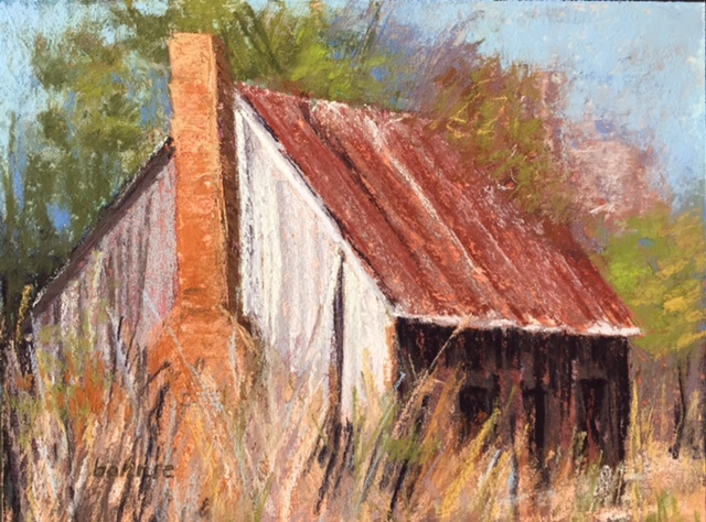
5"x7" quick pastel study

Who isn't attracted to vintage buildings? I love them and am always taking photos with a future painting in mind. On a recent trip to Alabama, I took some photos of this forgotten home on the edge of a cotton field. I did some sketches to get familiar with the structure and also did the quick study above to work out some of my color ideas.
pencil sketch in my sketchbook

14"x14" pastel on mounted pastel premier 400
Here is the larger finished painting. I did a watercolor underpainting to cover up the white paper. I had a lot of fun painting in the grasses. Giclee prints will be available of this painting.
9"x12" pastel on multi media pastel paper.
I had fun with this one. The underpainting was nupastel and clear gesso to add extra texture to the paper. Then I used a little watercolor, let it dry and then put the pastel on top. 

another sketch from my sketchbook of a barn I saw on trip to Connecticut . When visiting , I drive by it all the time , so I have seen it all seasons and painted it before. I had fun with the multi media pastel paper and decided to use it again for this painting.

"winter's grey" 11"x14" pastel on multi media panel

For the underpainting, I did a  blue violet Crete color drawing and brushed it in with the clear gesso. Then I went back with some nupastel for some of the color and brushed that in with the clear gesso which left me with a lot of texture. I used Terry Ludwig and Great American pastels to finish it off. Giclee prints will be available of this painting.


Sunday, January 8, 2017

about my pathway paintings

9"x12" pastel
I thought I would group together my favorite pathway paintings and write a little bit about this theme.  It captures the eye and brings you into the painting. The above painting I did from a reference photo taken in CT at a vineyard. It was a beautiful October day and the vines were bright with yellows and oranges. 
12"x16" pastel
This is from a reference photo from a favorite spot in my bother-in-laws beautiful garden. I always walk there when I visit, going up the stairs or down...... I did this painting at a Richard McKinley workshop where I received a wealth of information and inspiration.

12"x16" pastel
This painting is from Edisto Island SC. We were lucky enough to get a rental right on the beach. This is the pathway we walked every day to get down to the beach. I was fortunate enough to have had this painting juried into a pastel art show.

9"x12" pastel
 Another painting of that Edisto pathway......

12"x16" pastel
This painting is from a reference photo I took while driving around with my sister in CT. I made her stop and go back for the shot. I was so intrigued by the way the sky and clouds met the pathway on the ground. Which way do you see it? Sky to pathway or pathway to sky?

9"x12" pastel
Another vineyard painting with its rows of vines bringing you into the painting. This one from a borrowed reference photo of my sister while she was in Walla Walla WA

10"x10" pastel
This painting is from Edisto Island SC. As I was walking out from these trees, the painting below depicts what I saw. I stood there and took photos from both directions. The sun had just risen and the marsh was aglow with gold!. The road took you to the beach..... but the bugs were so bad I couldn't make the walking trip! 

12"x16" pastel


12"x16" pastel
Two paths merge briefly......

12"x16" pastel
On one of my autumn walks....... join me....

9"x12" pastel
This is at park that is very close to my home. Sometimes when I need solitude, this is where I can go. Follow me down the pathway....

9"x12"pastel

9"x12" pastel
This painting and the one above are paintings that I did intuitively. I had no plan, I just picked up the pastel sticks and painted what I felt.... can you tell I was in a somber mood? The pathways emerged in both these paintings.....


12"x16" pastel 
This is my most recent pathway painting. I have painted it before.... it is from a reference photo I took while I was at Gibbs Garden  GA in the wildflower fields walking with a close friend. The pathway drew me in.......where am I headed, what is around the corner?


Saturday, January 7, 2017

artist in the south


"those cotton fields"  12'x16' pastel on UART 400

It has been awhile since I have posted on my blog. I had to put a new operating system on my laptop. Since I'm not that great on the computer, it has taken me awhile to figure out! The holidays are over and the new year has begun and I am back in my studio. Living in the south, I have always been fascinated with the cotton fields. While down in Alabama for Christmas, I took some photos of the cotton fields and used them as references for some paintings.  Even in the winter, these fields are appealing to me. I started out with doing some small quick paints., not spending more than 20 minutes on each.

5"x7" quick pastel

5"x7" quick paint

I also did a sketch in my sketch book.
in my sketch book

Then I chose the pastels I would use in the painting, adding a few along the way. I try to keep my sticks limited to about 20.

underpainting
For this painting I decided to use a violet Creta color stick with an alcohol wash for the underpainting. I worked it like a drawing, then washing it in with the alcohol and a brush. I used a blue Nupastel for the sky and washed that in with the alcohol also. I wanted to add some more texture, so I added some clear gesso where the grasses and cotton stalks were over top of the Cretacolor drawing. Then I went in with the pastel lightly putting down  layers of pastel.
The cotton fields are so much a part of southern history and there are still many fields today. Machines are used today to pull the cotton from the stalks. I was surprised to see how much cotton is actually left on the stalks after wards.


Monday, September 5, 2016

Walla Walla WA

9"x12" pastel on Pastel Premier Italian clay 320

My sister went out to Walla Walla, WA this past week for some vacation time.  She texted me some photos and that was the spark to start a frenzy of painting for 2 days. I so wished I was there with her!  But I would have to rely on her photos for inspiration to paint. My sister knows what I like to paint, so she kept texting me photos.  Once I started painting I couldn't stop and did 5 paintings in the 2 days. 
This was actually the first painting. I had a smaller 8"x10" piece of the Pastel Premier italian clay 320. I am really liking this paper. I don't have to start with an underpainting because the paper already has a neutral putty color. It has a lot of texture and will take a lot of pastel layers. I turned on some music, I just wanted to start painting! This first painting I did quickly.  One of the vineyards she visited.

I decided to stick with the same paper for the series of paintings. This one is also 8"x10". I really had fun with the grasses. My sister tells me there are wheat fields everywhere, and the texted photos kept coming.  The color of the golden wheat was just beautiful. They had harvested early from all the rain they had , so much of it was cut. 

 I was now ready for a larger one. This one is 12"x16". I decided on a reference photo of some of the uncut wheat. Always good to practice painting the grasses. I had to tell myself to stop!
The fourth painting is one on the top. The structures standing starkly in the wheat fields where great. I think this is my favorite painting of the series.


For the final painting, I went back to the vineyard photos. This one is 9"x12", still on the italian clay paper. It was a cloudy day, the colors were cooler , so I pulled out more blue greens and neutral colors. I changed the perspective some to give the painting better composition. I feel like I want to walk into that vineyard. 
Thanks to my sister for sharing her wonderful photos with me. I'm gifting her the first two 8"x10" paintings and the other three will be available in my upcoming shows.
Art For the Park, Marietta GA November 2-3
Whimsical Wares Art and Gift Show, Marietta GA November 9-13
Vickery Village Artists Market, Cumming GA December 2-3


Monday, August 29, 2016

meet Molly !

"molly" 11.5"x15.5" Terry Ludwig And Girault pastels on Sennelier La Carte

Meet Molly!  This is my friend's dog at Frame Up II, where I work. She asked me to paint Molly and she will be hung up in the shop for all to see. No pressure, right? Wow! Black dogs are really hard to paint! When you look at them , of course you think "all black", right?  I decided not to get flustered and took a bunch of photos of Molly. I have painted other animals and it's really important for me to get to know them, their personality.
Molly at the frame shop

Then I  started sketching her, I really want to capture her personality and a likeness. Look how shiny her coat is…. not all black…. do you you see the grays and blues?


in my sketch book

Molly is really a sweet dog, part cocker spaniel part labrador… we think. Her coat is very wavy and shiny.

here is some of my progression

  The color is not good in these pics. I used a dark blue/gray Sennelier La Carte paper. It's my paper of choice for painting animals. I always start with the eyes…. do a basic sketch of the head and start laying in the darks. I do not use black pastel! I use Terry Ludwig's darkest violet and sometimes a dark blue. Next come some of the mid tones (Girault neutrals and friends by Richard McKinley) and highlights are last. 
I sent Molly's owner a pic and she couldn't wait to see the real painting. Frame is ordered and soon she will be hanging in the frame shop! I'm happy!


Sunday, August 7, 2016

Things I love about summer

"CT countryside" 8"x10" pastel on Pastel premier 600

In GA the kids have gone back to school. But summer is not over and it is quite hot outside. I saw a blog post of Karen Margulis' about continuing to enjoy the summer until it is really over. I decided to take her advice and paint one painting each day for a week about things I love about summer. I tried not to spend more than 30 minutes on each painting. I wanted them to be fun! No pressure…. it's still summer!
The above painting is actually the last in the series. My July trips to CT to visit with my family always involves driving around looking around for photo opportunities for my paintings.
I've included here photos of the progression of the painting. I used a blue violet nupastel to lay in the darks and went over it with an alcohol wash with a brush and then layered in the pastel. I used a Pastel Premier 600 paper , which is finer than I like to use…. I tend to be a little heavy handed with the pastels , so I filled up the tooth of the paper fast. 

"coneflower" 8"x10" pastel on Uart 500
In my courtyard.

"beachside at Edisto" 8"x10" pastel on Uart 500
The house on the left was where we stayed on our summer trip Edisto Island.

"nest" 8"x8"pastel on Pastel Premier 320 Italian clay
trimming up a shrub in my courtyard I found this abandoned nest. 

"beach" 8"x10"pastel on Uart 500 with a watercolor underpainting.
For this painting, I used a reference photo from a previous trip to the Florida Panhandle. To me, summer is not complete with out a beach vacation. 

"coneflower" 6"x6"pastel on UART 500
I don't know about you, but cornflowers are one of my favorite summer flowers!

"queen anne's lace" 9"x12" on UART 500
These are everywhere in the summer . I had to try my hand at painting them and actually spent more than the 30 minutes to get them right. 
So that's it for this week, already thinking about what I will paint next week. You can follow along with my paintings on FB. Just search - Bonnie Morgan Hyde fine art. Please "like" the page if you would like to follow along with my daily art postings.
Enjoy the rest of your summer!


Friday, July 22, 2016

my thoughts on sky painting….

"field day" 12"x16" pastel on  Uart 400 toned with oil stain of alizarin crimson and paynes gray

Does the pathway lead you to the sky or does the sky lead you to the pathway inward? What is your perspective?  The sky - each day we are blessed with it's ever changing beauty. I am thankful for each new day and all it has to bring.

various pastels from my reference photos taken at different times of the day

9"x12" pastel on Pastel Premier italian clay. 

Sunrise at Edisto Island SC. We rose early to catch the sunrise….. if you have not done this , it is a must for your "to do" list. The first cast of light as it hits the morning atmosphere. A favorite time of the day for me for photo taking with the soft edges of the atmosphere….

12"x16" pastel on Pastel Premier 320 with watercolor underpainting 

There is so much to learn about the clouds and atmosphere. Having an understanding of this really helps me to capture what I see when I paint. My reference photo was taken in the late afternoon - the sky was filled with cumulus clouds and the sky , that perfect blue.

14"x14" pastel on repurposed Uart 500

Oh the sunset! The end of the day. The colors can be brilliant, richer and warmer. This painting is from a reference photo my cousin took. She lives on Black Lake in upper Michigan and is fortunate to see the sunset almost every evening.
In August, I will be taking a workshop with Karen Margulis on painting the sky. I am so fortunate to live close to Karen! I hope to bring my sky paintings to the next level, showing more movement and expression.
To be added to my "to do" list - to paint the night sky and take a workshop with Stan Sperlack ( whose sky paintings I really admire). Hope you have enjoyed my sky paintings .