Friday, June 24, 2016

inspired by the oceanside

"thankful" 9"x12" pastel on Pastel premier 400
sunrise…a new day begins…

There is something that draws me to the oceanside - no matter the season. It calms me. It slows me down and I take time to SEE and FEEL my surroundings. The crash of the waves, the sand and the shells, the low country marshes and the wildlife. The sky and atmosphere - soft and cool in the morning, warm and bright in the evening. The humidity in the air softens the edges of the shapes I see. There is so much there for me to paint and enjoy. I thought it would be good to gather all my paintings from the last few weeks after my recent trips to Edisto SC and St. Simons GA. Most are done from reference photos that I took. But photos don't always tell the truth. So with my memories, notes and reference photos - I painted from my heart.

"beach walk" 12"x16" pastel on multimedia board
The first day arrived……


Edisto GA

Botany Bay Plantation on Edisto SC

St. Simons and Jekyll Island GA

And I end with a sunset, that we watched most evenings…….

I hope you enjoy my paintings


Friday, June 10, 2016

"tropical delight"


12"x16" unison pastel on Uart 500

Today's painting came to me very spontaneously . You know, when you are just feeling it and you can't stop painting until it's finished. 
I have been admiring palm tree paintings by two artist's that I follow on FB. So when I went off for some vacation time at the beach recently, I couldn't help but photo and study the palm trees.  For the last week I have tried painting them and drawing them in my sketchbook. I wanted to get more familiar with the palm trees before I did a larger painting.  
I recently loaded the Value Viewer app on to my iPad mini. I usually work from my reference photos on the iPad.  What a cool app this is! You look at your photo through the app and it gives you the color photo, a black/white version , a notan and a 3 value version which you adjust. I worked totally from the 3 value black, grey and white version for this painting. 
image on my iPad

 The last two weeks have been about experimenting and pushing myself to try new things. So why not start with a color scheme…. I picked a triad with orange, green and violet. I've had this set of Unison pastels that I have not used so I pulled them out.
Unison starter set 

 Uart 500 sanded paper is my safety paper, I'm familiar with it, so I decided to start with that. I had so much fun at the Richard McKinley underpainting workshop and wanted to practice more with the oil stain underpainting. I knew I wanted the drips of the paint and could get the more intense color with the oil stain.
oil stain underpainting

I told myself to take my time and really think out the underpainting and where i wanted the painting to go.  Excitement - I really liked the way it turned out and wanted to get started on the painting….but I had to let it dry. So I took a break and had some dinner. 

 
I started by laying in the darkest values on the palm fronds. After that I couldn't stop until I finished the painting! This was really fun for me to do, I had picked out the pastel sticks (about 20) in the triad color scheme and the painting came together quickly. I'm going to let it sit on my easel for the night so that I can look at it in the natural light in the morning and make any fine adjustments.


Sunday, June 5, 2016

May pastel paintings and sketchbook

8"x10" passtel on repurposed Uart 500

May was a month of exploration….. taking a 3 day workshop with Richard Mckinley and moving on with new ideas in my head. 2 beach vacations (Edisto SC and St Simons/Jekyll Island GA) - No painting at the beach, but a whole new perspective in looking at subject matter for reference photos and applying what I learned in the workshop. June I get back to work in my studio and I need to get out and do some  plein air painting!


My paintings and sketchbook for the month


Saturday, June 4, 2016

notes from a 3 day workshop with Richard McKinley

"almost there…" 12"x16" pastel on multimedia board 
with watercolor/impasto(clear gesso) underpainting

I've had two weeks to mull over my notes from a recent 3 day workshop with Richard McKinley. If you have taken one you know what I am feeling…. INSPIRED! I'll try here to give you the things that I felt were important to me, but there is so much more.
1) Intuitive painting comes with practice. The underpainting is a starting point for the painting.
2) SHAPES are identity,VALUE gives us form, the most important element, think like a sculptor, COLOR shows emotion.
3) atmospheric perspective - creates depth
4) Shadows have weight
5) SIMULTANEOUS CONTRAST - the effect one color has on another, dark and light,what is a shadow in the light, is a highlight in the shadow.
6) light is a reflection
7) bits and pieces
8) angle of vision, we are always the center of our painting.

The top painting is one I did in my studio, a week after the workshop.  I had headed to the beach with my family for week vacation the day after the workshop and everywhere I looked I saw potential for paintings. I took a lot of photos , but no painting….. Back home in my studio,  I took all these items listed above and thought about them as I did this painting. The impasto underpainting was the most exciting to me. It forced me to get away from the detail, to step back a lot and "suggest" what I saw in my reference photo. Those "bits and pieces" made the painting cohesive. 

I was able to complete three paintings in the workshop.
watercolor underpainting on Pastel Premier 400 white paper

12"x16"
I had painted this scene before, and it was fun painting it again with new ideas in my head.
Creta color and impasto with clear gesso on multimedia board.  when dry I added watercolor, let that dry and then put the pastel on from there.  

12"x16"
This was my favorite painting I did from the workshop. The impasto technique was so exciting to me!
oil stain underpainting. Diluting the oil paint with turbenoid to a watercolor like consistency. I need a lot more practice with this type of underpainting….

12"x16" on Pastel Premier 400 white paper.
Again from my own reference photo I had painted before. I always use my own reference photos now, feeling I have a better connection , what was it that intrigued me about the scene and any memories or notes I had on the photo. 

I headed out for another few days with just my camera. I even have a different perspective on what to photograph ….. it doesn't necessarially  have to be a beautiful scene to make a a good painting….. it's how we orchestrate the image. Can't wait to get back into my studio and get started on another painting! !
Just a note, If you have not taken a workshop from Richard McKinley and are serious about your painting, please sign up for one. He was a blast! we all had so much fun and learned so much. 


Monday, May 2, 2016

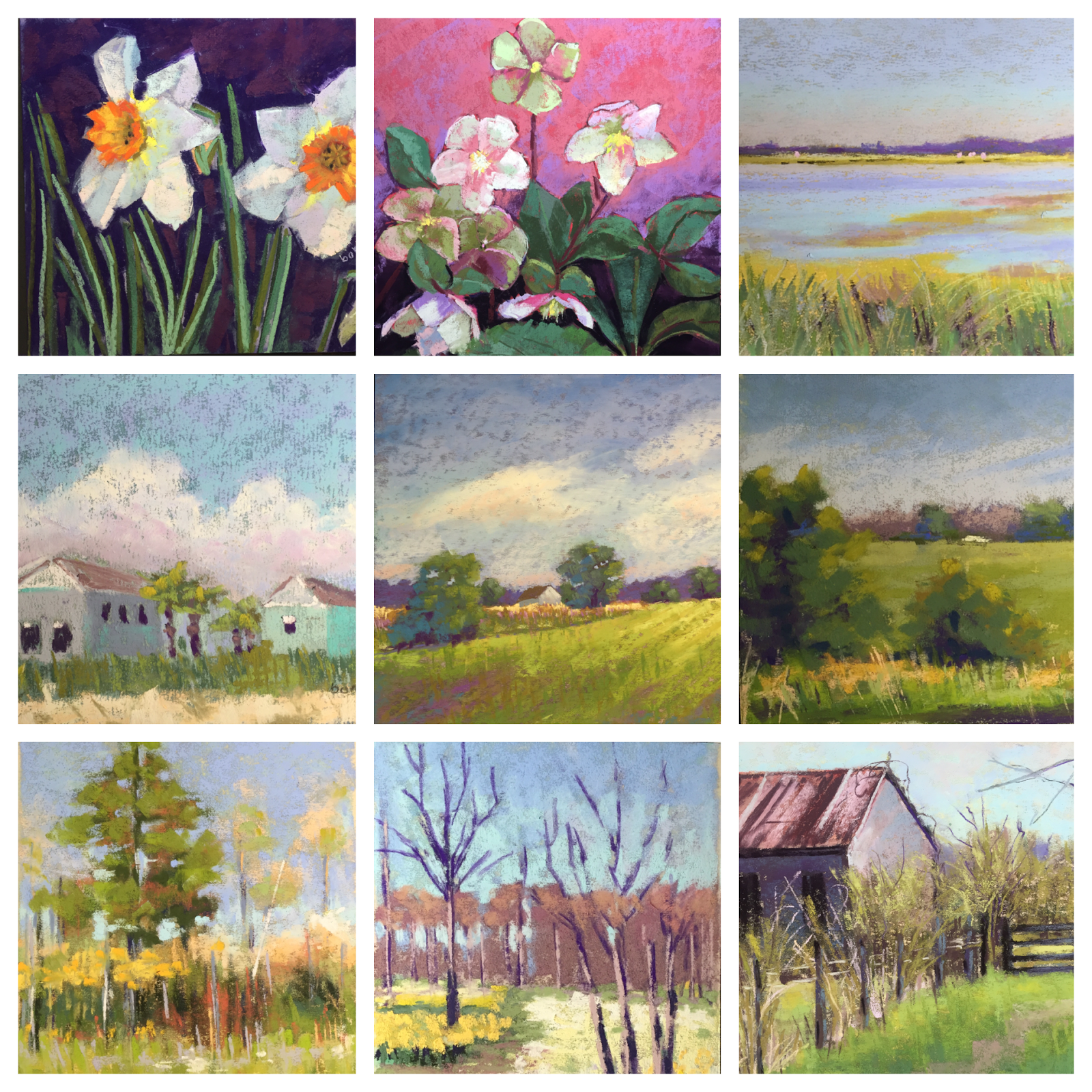
April's paintings and sketchbook

last sketch for the month of april

The month of April, I felt like I was in a slump. I was not connecting or feeling inspired . But I reminded myself of my goals for the year to do the daily paintings and sketches and pushed myself to accomplish something. After gathering my work for the month together in the grids , I felt much better about my accomplishments.
the paintings don't fit exactly, so this just gives you a suggestion. You can see that the spring season had arrived and I really had fun painting the flowers.


I tried some different surfaces for painting, using mat board coved with clear gesso and fine pumice gel. The last 2 paintings on the right of the bottom grid are with this surface. It allowed me to play and not worry about wasting a good piece of Uart sanded paper. The iris painting on the top left was my last painting for the month. 

from my sketch book.
I can't say enough about keeping a sketch book. I like to use pencil and black pen and some times add some watercolor. I missed a few days but I put time aside each day to just sketch , some drawings are great and some not so, but I know my drawing is improving. Some sketches I used for paintings.

 Gail Sibley, an artist I follow on Facebook, had done some blind contour drawings. I was intrigued and remembered doing them in college! It's where you look at something but don't look on the paper you are drawing the image of. You really have to think about where things are in relation to other things. It was fun! I tried a self portrait and one from my courtyard garden.

 I was asked to show my work in the Whimsical Wares Art and Gift Show again, local to where I live. I'm excited to say that I sold 7 paintings! It's always good to get affirmation…… So I move on to the month of May. I'm taking a 3 day workshop with Richard McKinley!


Thursday, April 21, 2016

"a summer's day"

"a summer's day" 12"x16" pastel on home prep mat board

 I have not been inspired to paint much these last couple of weeks, but still sketching every day.
in my sketchbook
On my iPad I keep most of my reference photos for painting. When using your own photos , I think you have a better connection. You were there, you took the photo, something caught your eye, so typically I paint from my own photos. I came across a photo on my IPad when looking for something to paint and found one  that was not mine. I don't remember where it came from, but I loved the photo. Not wanting to pressure myself, I decided to use the photo and did a sketch, it felt good….. 
I had fun with my last painting using mat board that I had prepped myself and decided to do this again.
 
I cleaned up my pastels and was ready to paint!
the board is white so I layer in the basic shapes with Nupastel and a turbenoid wash with a brush.

 It was feeling good, here is a progress shot. I got to this point and decided to let it sit for the night. 

Here is a close up detail. I'm liking the texture of this board, it forces me to be looser and get away from the details . I was constantly stepping back to make sure the painting was working. I finished the rest up this morning, working on the flowers in the foreground. I kept telling myself to forget about the detail and just suggest the flowers. I feel good with the end result.

Thursday, April 14, 2016

"play of light"

"play of light" 14"x14" pastel on home prepared board

I have been trying to paint and draw everyday. My problem with this is having enough material to work from. I'm a;ways on the look out for images to paint from. Sometimes there is nothing that seems to inspire me, so I go back through my photo images and pull from there. 


Here is the image I have used before. I took the photo on one of my many trips to Gibb's Garden. I was drawn to the play of the light on the shrub in the right hand side of the photo.  I painted it before and actually sold the painting! Since I'm having a tough time painting right now I thought I would work from this one again.


As part of my #dailysketch routine, I worked in my sketchbook with a fine black sharpie pen. I really liked how the drawing came out and used this as my reference for the next painting. It was time to play, so I used a mat board coated with clear gesso and then a coat of fine pumice gel. Not my usual Uart 500 paper! I just let myself go….. I did a watercolor underpainting to lay in the shapes and cover the white board. Then came the pastel….. the texture of the board was rough and took more pastel to cover it than what I was accustomed to. I worked on it for about 2 hours and stopped, I knew it was not finished , but I couldn't figure out what was not right about it. So it sat for the night and when I looked at it this morning, I saw it. It was flat…. my play of light was not there. Simultaneous contrast…… it all came back to me! I spent another hour making it right. I will say this is not my typical painting, but it was a fun exercise for me and  I think I will explore more paintings with this surface.